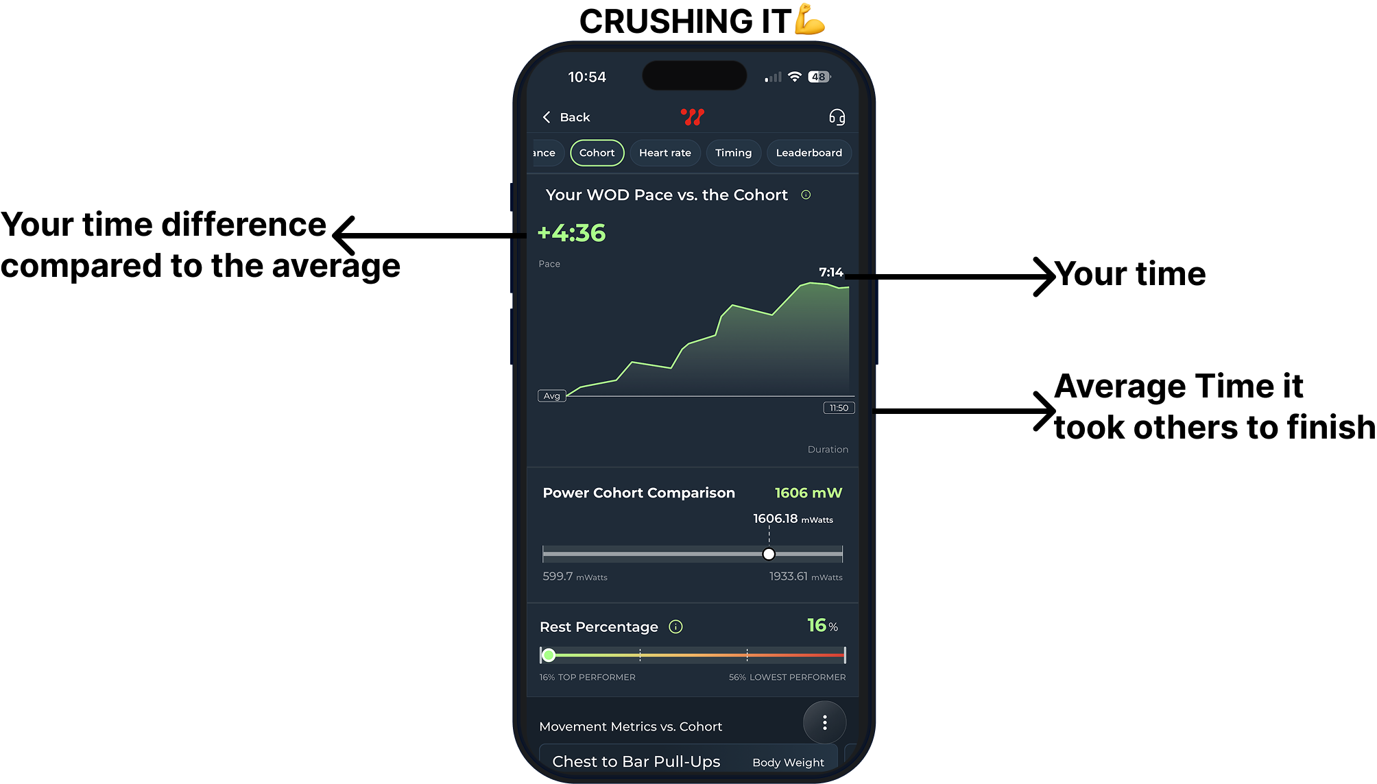
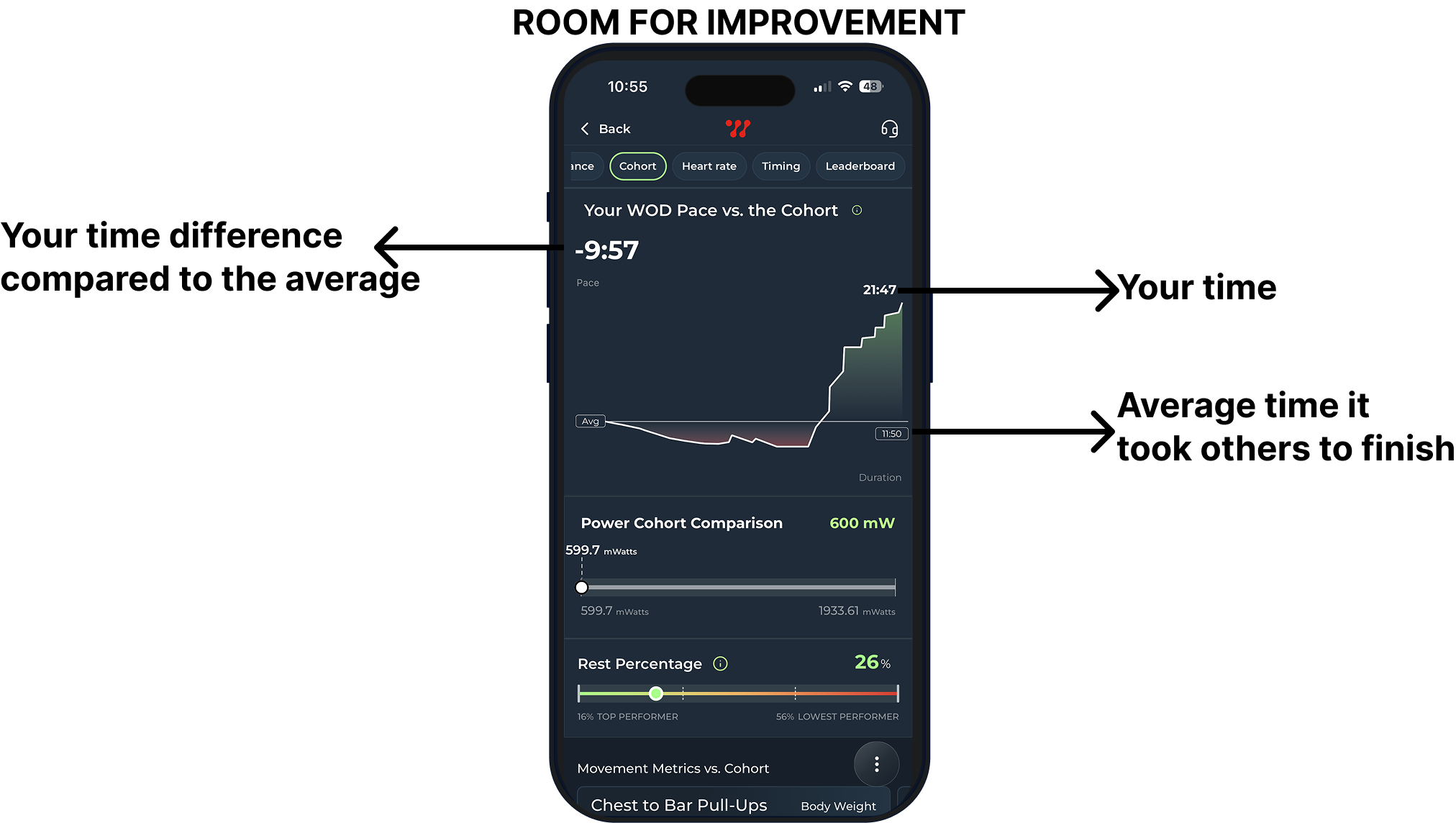
Explanation of Pace Graph
Pace Comparison: The graph compares your WOD pace against the group average.
X-Axis: Displays the duration of each round or the total WOD duration.
Y-Axis: Represents your pace relative to the group average, with the baseline showing the average pace.
Movement Breakdown: Your movement times are compared to the average, highlighting if you were faster or slower.
Info Bar: Shows clock time of movements in bold, with the “+/-” indicating your pace difference and the movement name.
Was this article helpful?
That’s Great!
Thank you for your feedback
Sorry! We couldn't be helpful
Thank you for your feedback
Feedback sent
We appreciate your effort and will try to fix the article